This is the third article in a five part series on structuring your website for conversion.
Part 1: The Art and Science of Product Grouping
Part 2: 5 Key Guidelines for Upselling and Cross-Selling
Part 3: Keep Visitors Focused on Your Website
Part 4: Add a Human Touch to Your Website through Live Chat
Part 5: Understanding Customer Pain Points
Capturing and maintaining website visitors’ attention can often feel like herding cats. Visitors will wander around on your site, clicking here and there, perhaps converting into customers, and perhaps – just as easily – going elsewhere to find what they’re looking for. Your job as a web designer is not to celebrate your SEO success, for all you’ve done is brought potential customers to your site. The reality is that SEO is not even half the battle – the real work begins once a visitor has landed on your site and needs to be convinced to do business with you. To accomplish this difficult goal, you need to keep your visitors focused on your site and lead them down a simple path toward the ultimate goal of conversion.
This article presents ideas and examples that will help you capture and maintain your customers’ attention while they familiarize themselves with your products and services. We will highlight 7 specific website design concepts and offer concrete suggestions on how you can keep your visitors focused on your website.
Get Clear on Your Goal
This is perhaps the most important factor in capturing and maintaining your visitors’ focus. You must at all times understand and have clarity of the goal of the overall website, as well as each individual page.
Be warned that your can easily lose sight of your goal, because you’ll often be tempted to implement fancy animation or eye-catching graphics simply for the aesthetic beauty and nothing else. This is not to say that you shouldn’t implement crafty artwork or fancy animations or cool videos; you simply need to review such additions in light of your website’s true goal.
You should break down your website goal into the following three sub-categories:
-
-
Who Is Your Target Audience?
Understand the type of customers you’re targeting. Are they engineers? Accountants? Soccer Moms? Once you’re clear on this demographic, you’ll have an easier time structuring your content and graphics. Engineers, for example, appreciate endless lists of features, whereas car enthusiasts want lots of cool pictures of sports cars.
-
-
What Is the Desired Action?
This question breaks down in different ways, depending on the specific page being designed. For example, one page may consider the subscription to an email newsletter to be a conversion, whereas another page considers a click on a shopping cart button a conversion. In all cases, you must identify a desired action on each page.
-
What’s in It for the Viewer?
Never lose sight of the value proposition to your customer. Each page must provide some sort of take-away for the customer, whether it’s an informative list of suggestions or an instructional video that helps customers understand your products or services
Don’t Make Your Visitors Search for Your Message
This is perhaps the #1 problem with most business websites. How often have you landed on a website only to search endlessly for information on what the company does? If you spend more than 10 seconds searching for the answer, consider yourself in the minority. Most people are not so patient. Your website should instantly convey what it does and make the journey for your visitor simple and fast.
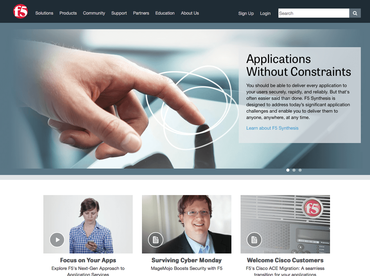
Take a look at the website for F5 Networks below. Is it immediately obvious what they do? The only hint you get is “Applications Without Constraints”. Though this is a compelling statement, it could be argued that visitors won’t “get it” and leave. Imagine wandering into a store, and the first thing a salesman says is, “Applications without constraints”. Immediately you know he’s not going to be of much use, and you’re probably going to turn and leave.
Walk Your Visitors through the Website
Though it may seem silly, big buttons and an obvious path through your site will yield success. Keep in mind that your visitors simply want a solution to their problem, and if they believe you have what they need, they will follow you. Think about it: isn’t it easier to follow a leader than to forge your own path through the jungle?
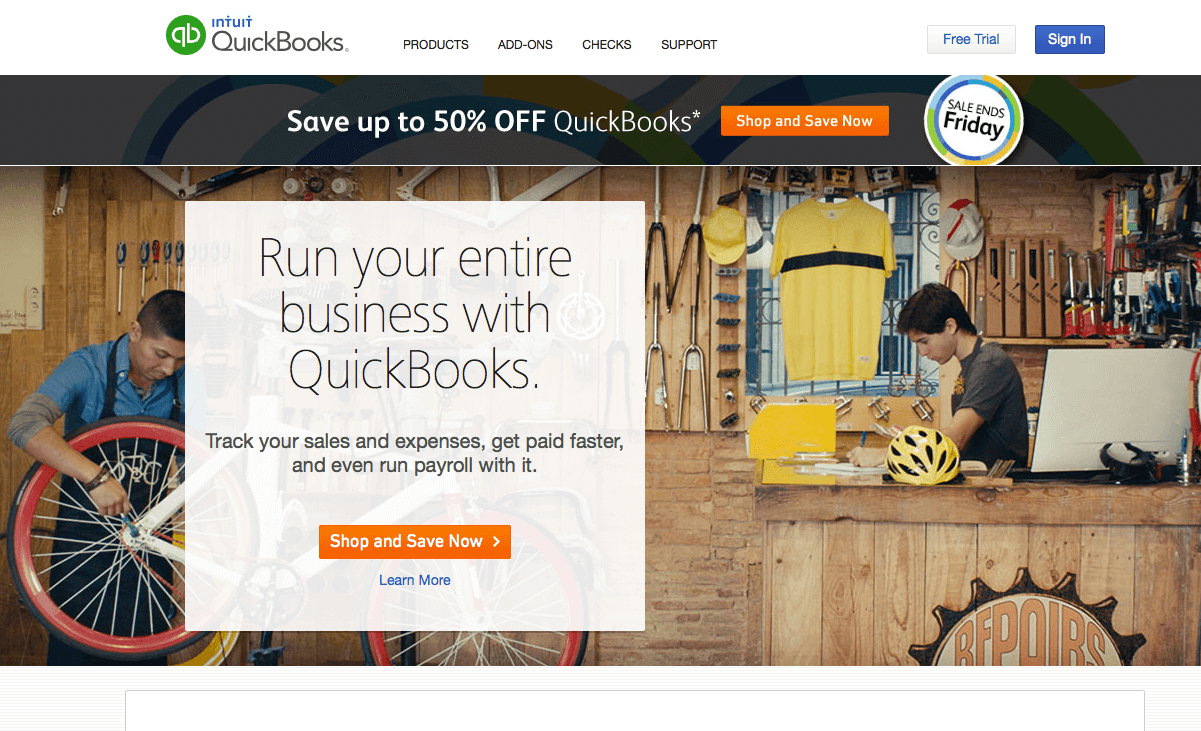
As a good example, scan your eyes down the QuickBooks landing page as shown below. You’ll quickly see a placard that says, “Run your entire business with QuickBooks. Track your sales and expenses, get paid faster, and even run payroll with it.” This message gets right to the point, and as your eyes scan down from that message, you see a big button for “Shop and Save Now.” This button leads you directly to a price sheet, where you can immediately compare features and the associated prices. But if you want to learn more before purchasing anything, you simply click on the “Learn More” link. You are then taken to a page that breaks out the main features of QuickBooks. And on that page, there is yet another “Learn More” link, which takes you onto the next step in your journey to eventual conversion.

Keep in mind that visitors don’t come to your site because they enjoy clicking on links. They are looking for information, and your site design – clever as you may think it is – can only get in the way. Be conscious of the clutter on the screen. How many messages are you sending to your visitors? Does each of these messages reflect your website’s goal? Also, understand the simple beauty of white space. Important information will not stand out if flashing banners, clashing colors and inconsistent font styles surrounds it. Surround your most important messages in a “quiet” buffer zone of white space. It will reduce the cognitive load on the human brain and help it focus on the message.
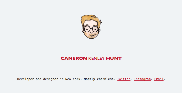
The example below may be a bit extreme, but notice how this clever landing page for cameron.io gets you to focus on a message that’s minimal in size but significant in magnitude.
Use Concise Writing
Get to the point. Quickly.Keep in mind that website writing is different than print writing. When people want to read a book, they’ll make time for it in their schedule. But they rarely come to your site with the same attitude. They will refuse to read long passages of promotional writing. If you can’t keep your writing short, then break it up with images and highlight the important text with bold letters. Break out multiple concepts into bulleted lists.
Additionally, avoid using company-specific language except where absolutely necessary. Use standard terms to refer to standard concepts. For example, use a button labeled “Learn More” when referring to more text, rather than something like, “Explore.” Use the standard buttons for RSS feeds, Facebook Likes, Twitter, and so on.
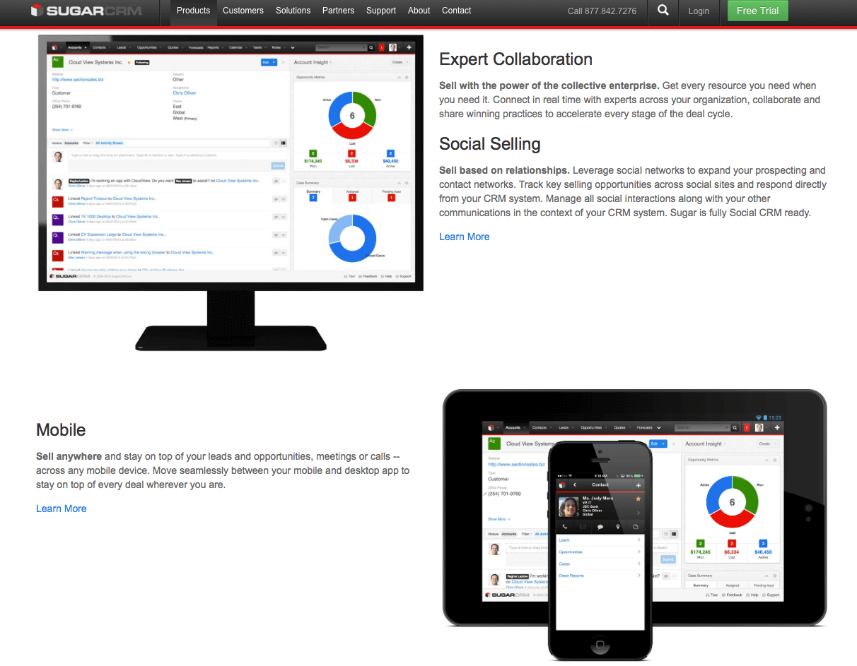
Notice how Sugar CRM breaks up different features into small bite-size chunks, each with its own graphic. They use the “Learn More” links to provide more information about each specific feature, so if you want to read more, you can. But if you stay on this page, you can quickly scan the features without spending a lot of time digging through text.
Communicate with a Clean Visual Design
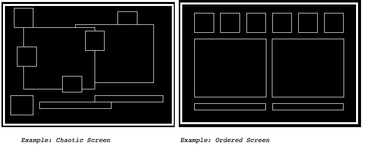
Suzanne Martin compiled an
excellent write-up on this concept. In general, you need to be aware of how the human brain visually perceives information. The main concepts are visual organization and standardization. The graphic below is a sample taken from the Martin’s page. It clearly demonstrates how a chaotic layout can adversely affect visual communication.
Maintain an Objective Perspective
It is well understood that creative people lose their objectivity when working on the same project day after day. Web designers in particular can get so enamored with their code that they lose sight of the usability factor. It is therefore imperative that the website get evaluated by stakeholders on a periodic basis, so that a set of objective eyes can provide guidance.
Objective reviewers must not only look at the design with a fresh set of eyes, but they must keep the overall goals in mind as they review each page. This can be difficult, especially when the reviewer has a sense of pride in the company. For example, the reviewer might say something like, “Let’s feature our industry awards on the front page where everyone can see them!” This desire is most likely counterproductive, for the reviewer has forgotten that the web page is for the potential customer, not for employees who are enamored with the company.
Summary
Capturing traffic on your website is indeed a good SEO challenge, but captured traffic does not equal conversion. SEO is only the beginning of the long battle for customer business. To keep potential customers on the site, you need to structure the site to maintain the visitor’s focus and interest. This often involves leading her through a simple path toward conversion. This article highlights some of the challenges in sustaining that interest level and offers specific suggestions to convert visitors into long-term customers.
In the next article in this series, we’ll talk about a relatively new but powerful online feature known as live chat, and how it can be used to help drive your conversions.
Download now: How to Create a Dynamic Live Chat Strategy
You’ve defined your live chat objectives. Next you need to find a way to implement your live chat objective effectively. This eBook provides you with several perspectives in developing the strategy and making full use of your live chat solution.
Download Now
eBook


